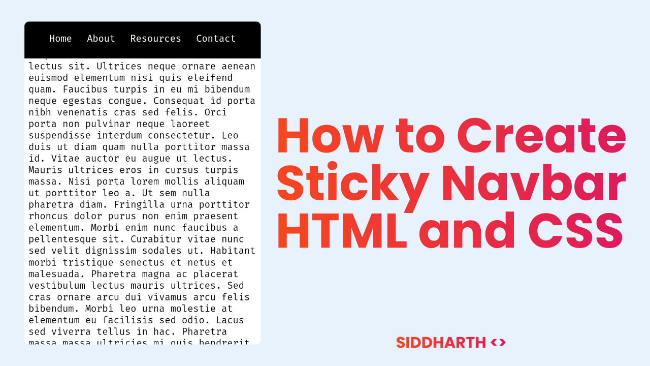
We are going to build a Sticky Navbar using CSS only. Our tutorial will guide you through the process of creating a navbar that stays fixed at the top of the page as you scroll, making it easily accessible for users. With just a few lines of CSS code, you'll be able to create a professional-looking and functional navbar that enhances the user experience on your website.
HTML Code for Sticky Navbar:
<nav class="navbar-sticky">
  <ul class="list-inline">
    <li>
      <a href="#">Home</a>
    </li>
    <li>
      <a href="#">About</a>
    </li>
    <li>
      <a href="#">Resources</a>
    </li>
    <li>
      <a href="#">Contact</a>
    </li>
  </ul>
</nav>
<p>Your content goes here...</p>
Here is Your CSS for Sticky Navbar:
body {
  margin: 0px;
}
.navbar-sticky {
	position: -webkit-sticky;
	position: sticky;
	top: 0;
	text-align: center;
	background: #000;
	padding: 8px;
}
.navbar-sticky a {
  text-decoration: none;
  color: #fff;
}
.list-inline {
	list-style: none;
	margin-left: -0.5em;
	margin-right: -0.5em;
	padding: 0;
}
.list-inline > li {
	display: inline-block;
	margin-left: 0.5em;
	margin-right: 0.5em;
}
.list-inline > li:before {
	content: "\200B";
	position: absolute;
}
p {
  margin: 8px;
}
You have successfully learned creating Sticky Navbar using HTML and CSS. No JavaScript was used in making of this Navbar. If you have any doubt. Leave the comments below. Thank you!


Comments
Post a Comment